Thursday, 20 November 2008

Milk Raid!


I started this image quite a few months ago. I got it to a point where it was almost finished, but wasn't happy with the mood and lighting. I left for it for a while and had a re-think. Coming back with fresh eyes allowed me to see where it wasn't working and alter it. I'm not 100% happy with it, but it almost never got finished so I'm glad to get something done.

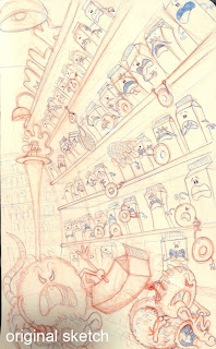
The picture shows supernatural undead doughnuts (the donutters) raiding the Monkey Mart milk chiller. Our hero (on the pedestal) is distraught as his adoptive mother is been dragged away by rat-riding donutters.

I've also added a few images showing the progression from sketch book drawing through to final piece. After lighting and texture passes were added I finished the image with reflections, highlights, atmospherics, optical effects and grading.

Milk Raid Breakdown


Monday, 4 August 2008

Supermarket Design


Supermarket design for an ongoing project I'm developing. The building was designed in Maya and then roughly lit, and rendered. The render was then worked up in Photoshop. I've been trying to speed up my workflow and not worrying too much about leaving roughly painted bits in. Instead I've put detail where it's needed and kept it loose where it isn't.

Wednesday, 16 July 2008

Sketch


Another sketchbook scan.

Friday, 11 July 2008

A bit of 3D


Here's a still from one of the animations that I entered into the E4 Stings competition. You can see the stings on my website or by hunting around the E4 website (http://www.e4.com/)

Some Sketches


A few scans from my sketchbook.

Some Speed Painting


My 2D artwork usually starts life as a sketch, or rough 3D mockup. I then work it up in photoshop using a few custom brushes and standard tools and filters etc. I tend to approach it in a similar way to my 3D work, ie filling in diffuse colour, painting texture,adding soft shadowing and indirect light, then key, rim, bounce lighting. Finally I add effects like glow, highlight blooming, optical effects.... stuff like that. It means I can easily tweak my images until I'm happy with the lighting and grading. Also, I often get into a 3D mindset where I try to make everything pixel perfect.


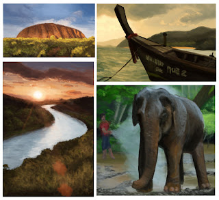
However, all this takes a lot of time. I've been trying to find ways of speeding up my workflow. So, I've started doing a bit of speed painting to loosen my technique up a bit. These are my first attempts and are basically copied from photographs that I've taken. I used the photos as visual reference and as a colour picking pallette, however the actual layout and painting was done with a simple photoshop brush, using one or (maximum) two layers.


I've found it to be a very useful discipline which helps you to focus on colour, form and contrast, rather than detail. I'll be working on a few more soon, however they'll be from scratch rather than from photos.

Short Film Artwork


A piece of artwork for a short film idea by a collegue.

Haunted Landfill Site


Concept artwork for a personal project that I've been working on for a while. More artwork and designs to follow.

Book Of Conversations Illustration


This is a piece of illustration that I did for "the Book of Conversations" http://www.bookofconversations.com/


120 artists, designers and photographers were each given a question to illustrate. Mine was "what rumour did you start?" I decided to base my illustration around rumour mills (a phrase that I think may not translate outside the UK.) The idea is people are drawn to the bright, glitzy glamour of the rumour mills. However the mill workers are, literally, plucking rumours out of the air. Winds drive the sails, which drive the cogs - each with random words and phrases, which mesh together to form a rumour. This is then whispered down to the eager people queuing outside.


The book is in publishing negotiations and should be out soon, followed by an exhibition.